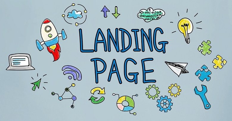
Landing pages are all the rage today - because they work. Considering how effective they are and how easily they can be made using landing page automation applications, a lack of results means that somewhere there is a problem. One of the biggest causes of ineffective pages is poor design. Fortunately, you can easily improve the landing page creation process to avoid these common pitfalls.
1. Slow Page Loading
When it comes to page load time, landing pages are no different than any other webpage. You have mere seconds to pique the interest of viewers. If they load slowly, you risk losing the audience. Avoid load speed problems by testing pages and optimizing them for faster load time. The best content and amazing offers mean nothing if audiences never actually view them.
2. Bland Headlines
Once your page loads, what is the first and most prominent thing that readers will see? If it is a bland, boring headline that does not hook the reader, chances are your entire message will be lost. Most readers only read the headline before deciding if they are interested in the offer.
To make sure your promotional website hooks viewers and pulls them in to read the rest of the content, landing page creation should include large, bold headlines that are specific, focus on the most important feature, and understand what the viewer wants or needs. Create interest and add value by mirroring your audience's thoughts and turning this into an eye-catching headline.
3. Typeface Problems
Like slow load time, the wrong typeface can negatively affect your landing pages by making them less readable. Only use two or three fonts and use them in the right ways. Serif fonts, wider letter spacing, and more line spacing facilitate comprehension of body copy.
Bolder and larger headlines are more comprehensible in sans-serif fonts. Body copy must also be large enough to be easily read, while still being small enough to differentiate it from headlines.
4. Unimpressive Offers
The goal of using landing page automation to produce enough pages to reach interested viewers is to show them something they want or need and convert them. When the offer is just not impressive, all of that effort is wasted.
Generate interest and urgency by offering something different that users cannot get elsewhere, something your audiences want but must act quickly to receive. Make sure the offer actually addresses their needs and solves their problems. Check your headline to be sure it presents the offer in an attractive way.
5. Overlooked CTAs
After fine-tuning everything referenced above, landing page creation must include an effective Call to Action that clearly prompts the reader to convert. Whether using a button, text link, or signup form, it must be colorful, contrasting, bold, and obvious. It should promise what the headline offers.
A good CTA must include clear instructions explaining how the reader can get the offer. It should be positioned where readers are most likely to notice it, usually at the middle or left-hand side of the screen below the fold. The CTA is the final step in generating conversions, so it must be noticeable and convincing.
If you are not getting the desired results with your landing pages, is it because they suck? If they suffer from any of these issues, they might. Improve your lead pages by paying attention to these 5 important tips and watch conversions start rolling in. Best of all, landing page automation applications like SiteSuperCharger make landing page creation even faster and easier!
